Responsive Grid CSS
We have had many requests to make the grid feed responsive. Until we find the time to create these shortcode options you can add this CSS to the Custom CSS option on the Settings > Global Options page of our plugin. This css will give you 3 posts on a row. When the browser gets to around 960px in width it will give you 2 posts in a row, and when it goes below 640px it will show the posts 1 in a row, which usually happens on mobile devices or small widgets. You can of course adjust the values below or add some to make it work for you.
This will work for the Facebook Feed Grid or Twitter Grid format.
- The first thing you want to do is remove the value for colm_width= and spacing_between_posts= values in your shortcode. Leave the attributes, just remove the values. ie* … grid=yes space_between_posts= colmn_width= …
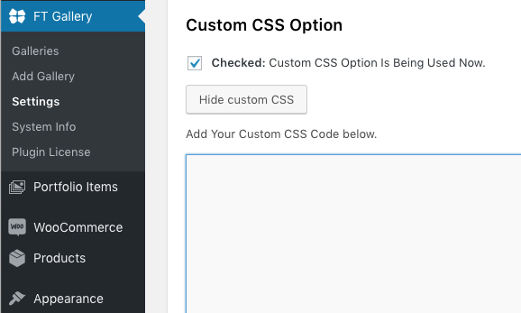
- Add the CSS below the photo to the Custom CSS box on the Settings > Global Options page of our plugin.

.fts-slicker-facebook-posts, .fts-slicker-twitter-posts { width:100% !important; } @media screen and (min-width:640px) { .fts-jal-single-fb-post, .fts-tweeter-wrap { width: calc(50% - 10px) !important; margin:5px !important; } } @media screen and (min-width:960px) { /* 33.3333% is 3 posts in a row. -10px is the total margin from left to right we subtract considering we want a margin of 5px of spacing below If you wanted 4 columns it would be 25% and so on */ .fts-jal-single-fb-post, .fts-tweeter-wrap { width: calc(33.333% - 10px) !important; /* margin 5px totals 10px if you add the left and right side that is why we do -10px above. */ margin:5px !important; } } - This will work for the Combined Streams Grid.
.fts-mashup {
    width:100% !important;
}
@media screen and (min-width:640px) {
    .fts-mashup-post-wrap {
        width: calc(50% - 10px) !important;
        margin:5px !important;
    }
}
@media screen and (min-width:960px) {
 /* 33.3333% is 3 posts in a row. -10px is the total margin from left to right we subtract considering we want a margin of 5px of spacing below
    If you wanted 4 columns it would be 25% and so on */
    .fts-mashup-post-wrap {
        width: calc(33.333% - 10px) !important;
/* margin 5px totals 10px if you add the left and right side that is why we do -10px above. */
        margin:5px !important;
    }
}
See Example of Responsive grid after applying the CSS above.